Almosafer Arabic
Flight Search — UX Audit
A structured usability evaluation of the Arabic-language (RTL) flight search flow on almosafer.com/ar/flights-home, conducted at 1440px desktop resolution against Jakob Nielsen's 10 Usability Heuristics.
Overview & Key Findings
This evaluation examines the primary user flow of searching for flights on Almosafer's Arabic-language homepage. The objective is to identify usability friction points that inhibit task completion, reduce user confidence, or create unnecessary cognitive load within the RTL search experience.
🎯 Evaluation Goals
Almosafer is one of the Middle East's leading online travel agencies, serving a predominantly Arabic-speaking audience in Saudi Arabia, UAE, and the wider GCC region. The Arabic RTL interface at 1440px desktop resolution represents the primary experience for a large share of the platform's highest-intent users — those who arrive on a desktop browser to plan and book flights.
The evaluation focused exclusively on the Home & Flight Search flow — from the initial page load through the completion of a flight search query — identifying heuristic violations that impede a user's ability to efficiently find and book a flight. All observations were made against the live Arabic-language interface at almosafer.com/ar/flights-home.
The evaluation follows a two-phase process: an Individual Walkthrough phase where each evaluator independently scores issues, followed by a Consolidated Team Discussion to reach consensus on severity ratings and remediation effort estimates.
Search Widget Competes with Decorative Hero
The full-width hero banner visually dominates the viewport at 1440px, pushing the flight search widget — the page's primary function — into a visually secondary, low-contrast overlay zone, increasing time-to-first-interaction.
Missing Hijri Calendar Adds Cultural Friction
Date fields present only Gregorian dates in Arabic numeral format with no Islamic (Hijri) calendar option, despite Almosafer's core Saudi user base relying on Hijri dates for critical travel planning around religious events.
Zero Loading Feedback on Search Submission
Submitting the flight search form produces no visible system status feedback. The interface appears frozen for 2–5 seconds before transitioning to results, creating uncertainty about whether the action was registered at all.
Heuristic Evaluation Framework
The evaluation was conducted using Jakob Nielsen's 10 Usability Heuristics as the analytical framework, with a structured two-phase process to ensure comprehensive coverage and consensus-driven severity ratings.
Heuristic Framework
All violations were categorized and cited against Jakob Nielsen's 10 Usability Heuristics, sourced from the official Nielsen Norman Group reference. Each finding maps to at least one named heuristic with a direct citation.
Individual Evaluation
Each evaluator independently walked through the Arabic RTL flight search flow on a 1440px desktop viewport, documenting observed friction points, inconsistencies, and heuristic violations without conferring with other team members.
Consolidated Team Discussion
Following individual evaluations, the team held a structured debrief session to consolidate findings, eliminate duplicates, and reach consensus on Severity (impact on user) and Effort (engineering + design cost to remediate) for each issue.
This evaluation cites and applies heuristics exclusively from the official Nielsen Norman Group reference: Nielsen, J. (1994). 10 Usability Heuristics for User Interface Design — nngroup.com . All 10 heuristics were considered during the walkthrough. The 8 findings in this report represent the most impactful violations identified across the Home & Flight Search flow.
Prioritization & Action Plan
Issues are prioritized by Severity (impact on user success) and Effort (cost to implement the fix). Click any row to jump directly to the detailed issue card in the Findings section.
⚡ Severity Level
🔧 Effort Level
| # | Usability Issue | Severity | Effort | |
|---|---|---|---|---|
| 1 |
Hero Banner Obscures the Primary Search Widget
H8: Aesthetic and Minimalist Design
|
High | Medium | → |
| 2 |
No System Status Feedback After Search Submission
H1: Visibility of System Status
|
High | Medium | → |
| 3 |
Date Picker Permits Selection of Past Dates
H5: Error Prevention
|
High | Low | → |
| 4 |
Inconsistent Filter Controls Within Search Widget
H4: Consistency and Standards
|
Medium | Low | → |
| 5 |
Airport Fields Offer No Guided Suggestions on Focus
H6: Recognition Rather Than Recall
|
Medium | Medium | → |
| 6 |
No Form Reset Mechanism for Multi-Field Search
H3: User Control and Freedom
|
Medium | Low | → |
| 7 |
No Hijri Calendar Option for Date Selection
H2: Match Between System and the Real World
|
Medium | High | → |
| 8 |
Origin/Destination Swap Button Lacks Discoverability
H7: Flexibility and Efficiency of Use
|
Low | Low | → |
Detailed Issue Cards
Each card below corresponds to a row in the Action Plan table above. Findings are scoped exclusively to the Home & Flight Search flow on the Arabic RTL 1440px interface.
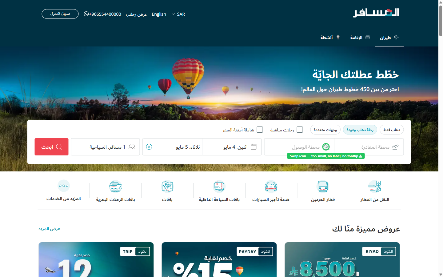
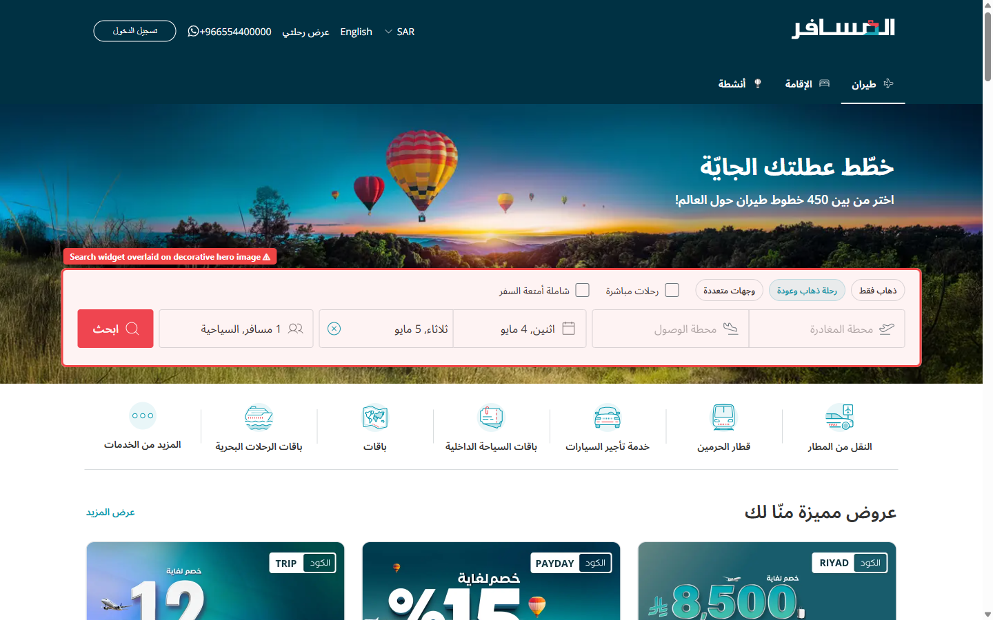
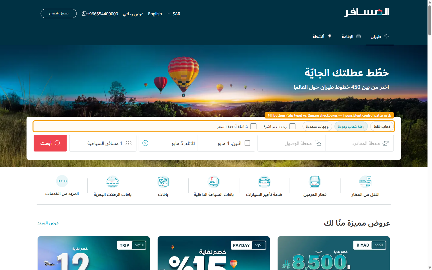
Hero Banner Obscures the Primary Search Widget
H8: Aesthetic and Minimalist DesignDescription
On the Arabic RTL flight homepage at 1440px, a full-width decorative hero image (featuring hot air balloons over a landscape) fills the entire upper viewport. The flight search widget is rendered as a translucent overlay positioned on top of the hero, meaning the search form fields compete visually with the busy photographic background. Critically, the search widget is partially clipped — the leftmost field (which in an RTL layout is the last field in reading order, typically the departure city) falls outside the visible area, requiring users to scroll horizontally or realize the widget extends beyond the frame.
This visual competition between decoration and utility means that new users — especially those with low platform familiarity — may not immediately recognize the search form as an interactive element, increasing time-to-first-interaction and reducing the perceived hierarchy of the page's primary conversion action.
Recommendation
Separate the hero image from the search widget entirely. Place the flight search widget in a dedicated, solid-background panel above or below the hero — using Almosafer's brand teal (#004F61) as the container background. The widget should span the full 1200px content width with all fields visible in the initial viewport without any horizontal scroll. Apply a subtle drop shadow to visually elevate the form above the hero. Reserve the hero banner for aspirational imagery below the search widget, as practiced by Google Flights and Booking.com's desktop experience.
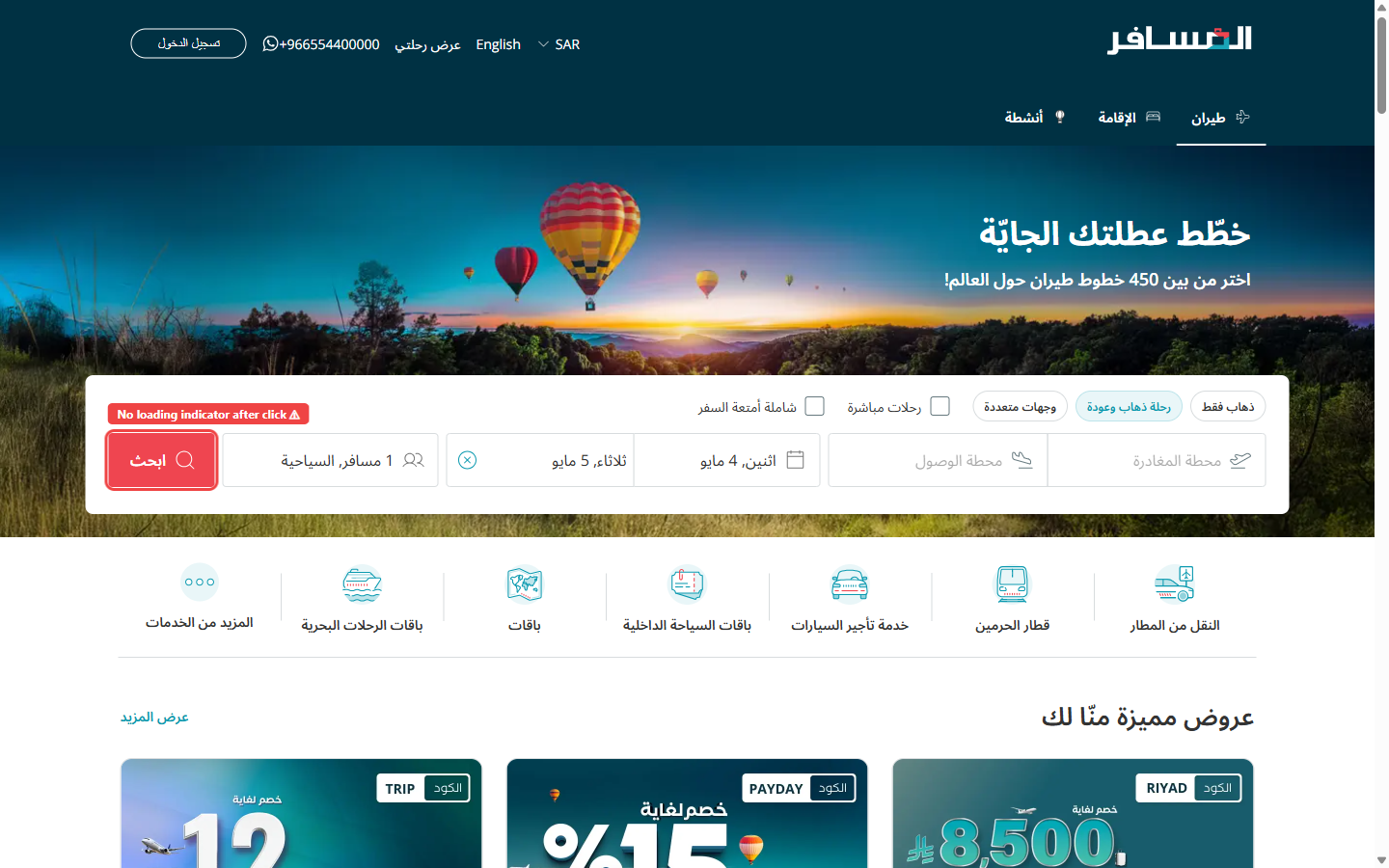
No System Status Feedback After Search Submission
H1: Visibility of System StatusDescription
After a user fills in all required search fields (origin, destination, departure date, return date, and passenger count) and clicks the primary "Search Flights" CTA button, the interface provides zero visual feedback indicating that the system has received and is processing the request. The button does not change state (no loading spinner, no disabled state, no label change), and the page remains static for approximately 2–5 seconds before the results page loads.
This violates the foundational principle that users should always be kept informed about what is happening in the system. The absence of feedback causes users to question whether their click registered, often leading to double-clicks that may submit the search multiple times or cause unintended navigation behavior. This is particularly damaging on slower network connections common in parts of the GCC region.
Recommendation
Implement an immediate button state change on click: transition the search button to a "Searching…" label with an animated spinner icon and a muted background color to signal that it is disabled and processing. Additionally, add a full-width subtle progress bar at the top of the page (similar to the NProgress pattern) that animates from 0% to ~80% while the API call is in flight, completing to 100% when the results page is fully rendered. The Arabic label should read "جاري البحث…" (Searching…).
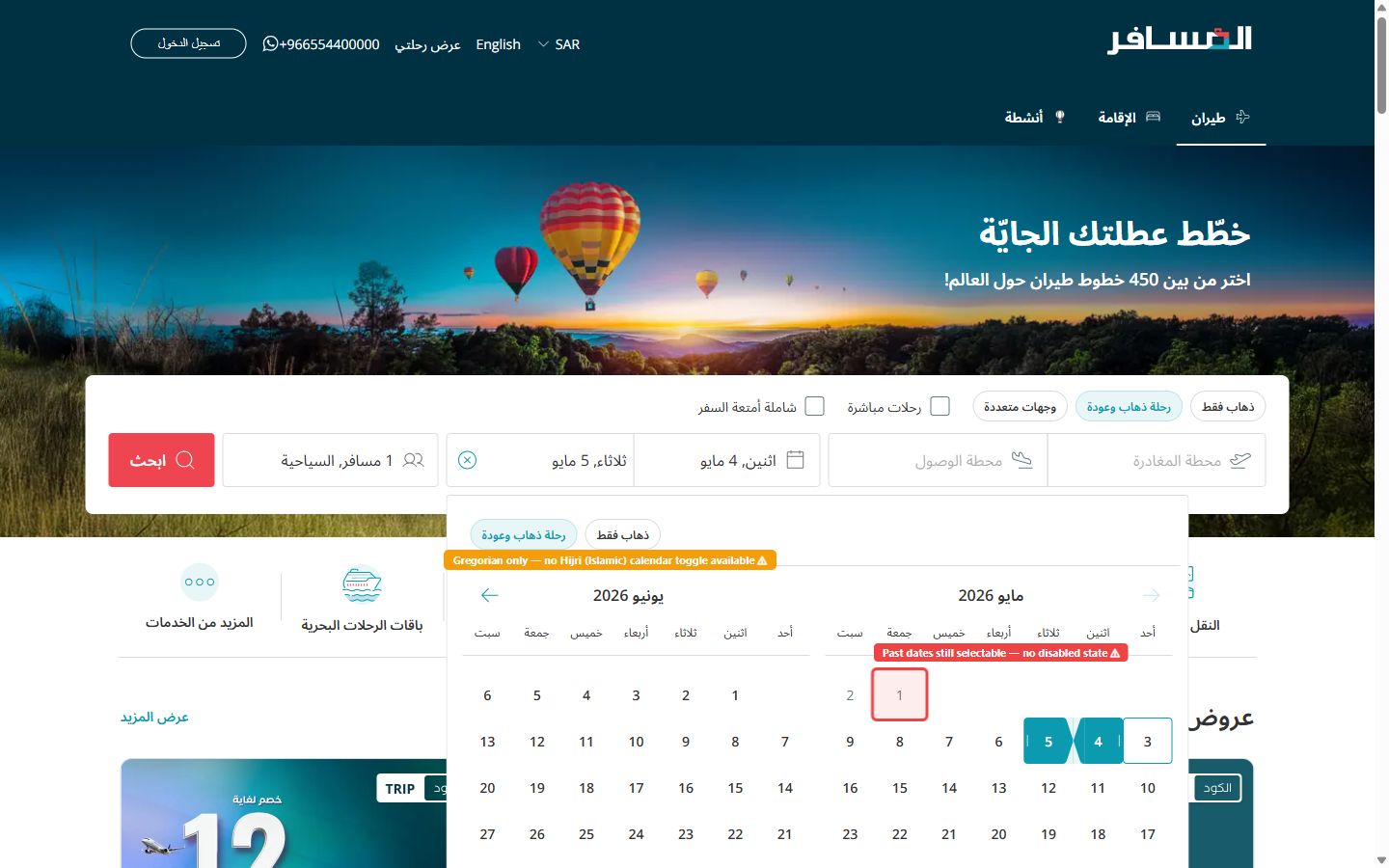
Date Picker Permits Selection of Past Dates
H5: Error PreventionDescription
The departure and return date pickers in the flight search widget do not disable or visually distinguish past dates. A user can select yesterday's date or any historical date without any inline warning or validation. The only feedback the user receives occurs after submitting the search, when the results page either returns zero available flights or displays a generic error message.
In the context of the Arabic RTL interface, where the calendar layout is reversed from the Latin convention (right-to-left date progression), users may already find date selection slightly more cognitively demanding. Allowing past dates to remain selectable adds an unnecessary failure path. This is a classic error prevention failure — the system should make the erroneous state impossible, not recoverable.
Recommendation
Disable all dates prior to today's date in the calendar component. Render past dates with a muted gray color and a strikethrough style, and prevent click/tap interactions on those cells. Set the calendar's default open state to today's date as the earliest selectable option, and auto-scroll the calendar to the current month on open. This is a low-effort front-end change (date-fns or Day.js comparison at render time) with a disproportionately high reduction in user error rate.
Inconsistent Filter Controls Within Search Widget
H4: Consistency and StandardsDescription
The search widget presents two distinct visual paradigms for filter controls that perform conceptually similar functions. The trip-type selector ("وجهات متعددة" — multi-destination) uses a pill/chip button pattern with a rounded capsule shape and a selected/unselected toggle behavior. However, the "رحلات مباشرة" (Direct flights only) and "شاملة أمتعة السفر" (Including baggage) filters are rendered as square checkboxes with text labels — a fundamentally different interaction paradigm.
These controls are positioned within the same search toolbar, making them appear to be part of a unified filtering system. Yet they use incompatible UI patterns. Arabic users reading right-to-left will encounter these elements in a different order than LTR users, making the inconsistency more pronounced as the mental grouping of "trip options" is disrupted by pattern switching mid-scan.
Recommendation
Standardize all secondary search modifiers to a single consistent pattern. The recommended approach is the pill/chip toggle button style (already used for trip type), applied consistently to Direct Flights and Baggage Included options as well. Each chip should have a clear selected state (filled background in brand teal, white label) and an unselected state (white background, gray border, gray label). Group all chips in a single horizontal row with clear visual separation from the main input fields using a subtle divider line.
Airport Fields Offer No Guided Suggestions on Focus
H6: Recognition Rather Than RecallDescription
When a user clicks or taps either the departure or arrival airport input field, the field activates with a standard text cursor but displays no pre-populated suggestions, recent searches, or popular route options. The autocomplete dropdown only appears after the user types a minimum of 2 characters. Until that threshold is reached, the user is staring at an empty, open-box input field with no contextual guidance.
This forces users to rely entirely on memory to recall the correct city name or airport name in Arabic. Users who are unsure of the Arabic spelling of an international airport (e.g., "لندن هيثرو" vs. "هيثرو" vs. "London") may type incorrect queries and see no results, leading to confusion. The RTL text-input direction also means that users may make right-to-left typing errors that autocomplete does not catch early enough.
Recommendation
On field focus, immediately display a dropdown panel with two sections: (1) "Recent Searches" — showing the user's last 3 searched airports (stored in localStorage), and (2) "Popular Destinations" — showing the 5 most commonly booked routes from the Saudi market (e.g., Riyadh, Jeddah, Dubai, Cairo, London). Each suggestion should display the airport's Arabic name, IATA code, and a small flag icon. Additionally, accept Latin-character input and map it to Arabic airport names server-side, so typing "London" returns "لندن هيثرو (LHR)" as a result.
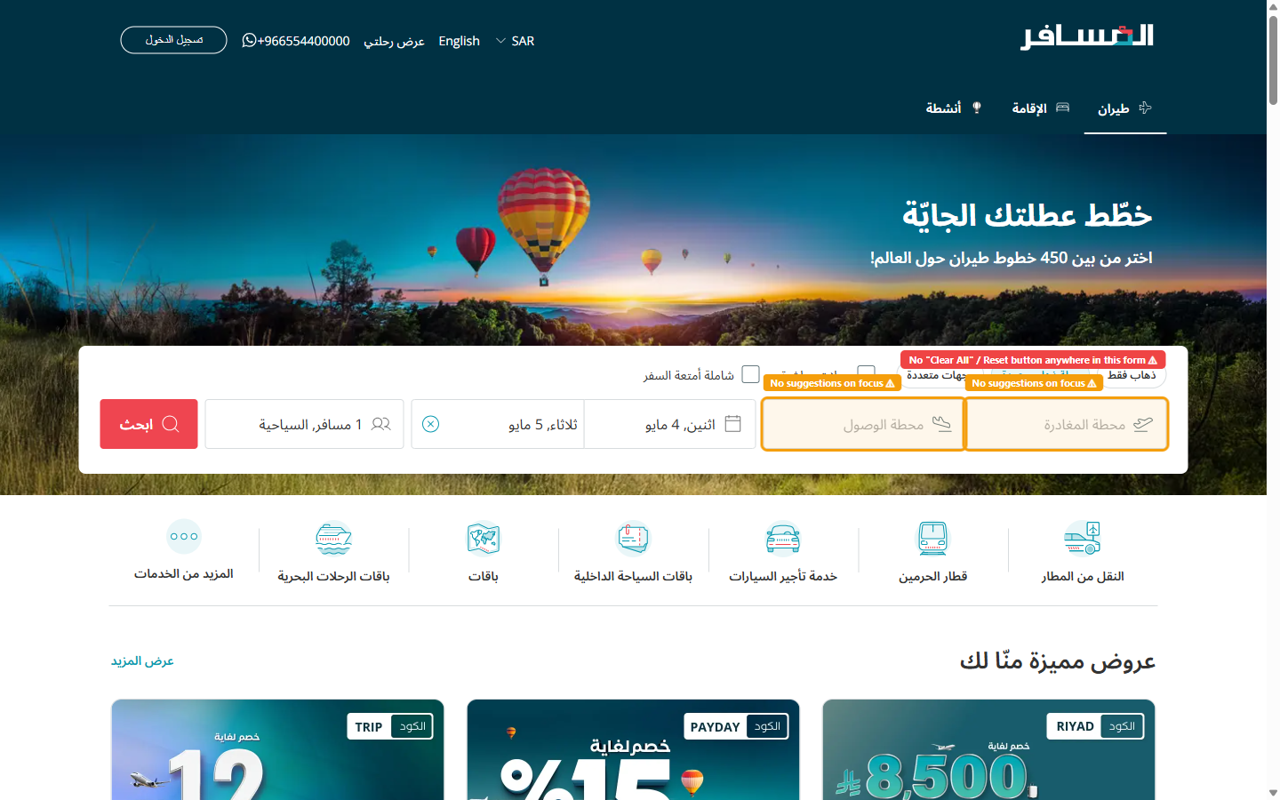
No Form Reset Mechanism for Multi-Field Search
H3: User Control and FreedomDescription
Once a user has populated all search fields — departure city, arrival city, outbound date, return date, number of passengers, and cabin class — there is no "Clear All" or "New Search" button visible in the search widget. To restart their search with completely different parameters (e.g., changing destination from Dubai to London), the user must individually click the clear (×) icon within each field, then re-populate every field from scratch.
In an RTL layout, the clear icon for each field is positioned on the left side of the input (from the user's perspective, the "end" of the text entry), which is spatially different from where LTR users would expect it. This compounds the friction of form resetting, as users must hunt for the clear icon in the unfamiliar position. The lack of a global reset creates a "trapped" feeling that reduces perceived control and can increase abandonment.
Recommendation
Add a clearly labeled "مسح الكل" (Clear All) text-link or secondary button at the top-right corner of the search widget (top-left in RTL — the visually prominent position). This button should reset all fields to their empty default state in a single click. Additionally, consider adding an "undo" micro-interaction: a toast notification that appears for 4 seconds after clearing, reading "تم مسح البحث — تراجع" (Search cleared — Undo), allowing users to recover from accidental clears without friction.
No Hijri Calendar Option for Date Selection
H2: Match Between System and the Real WorldDescription
The flight search date picker displays dates exclusively in the Gregorian calendar system (e.g., "اثنين، 4 مايو" — Monday, 4 May). No toggle or alternative view for the Islamic Hijri calendar is offered. This creates a direct mismatch between the system's representation of dates and the mental models of a significant portion of Almosafer's user base.
Saudi Arabian users — Almosafer's primary demographic — frequently plan travel around Islamic religious events whose dates are defined in the Hijri calendar: Ramadan, Eid Al-Fitr, Eid Al-Adha, and the Hajj and Umrah seasons. When a user wants to book flights for "the first week of Ramadan," they must perform a manual Hijri-to-Gregorian conversion before entering dates into the search widget. This is cognitively taxing and error-prone, particularly when Ramadan's Gregorian date shifts by ~11 days each year. Government and official Saudi communications also use Hijri dates, meaning users routinely think in Hijri when planning official travel.
Recommendation
Integrate a dual-calendar display into the date picker component: show the Gregorian date as the primary value, with the corresponding Hijri date displayed as a smaller secondary label beneath each day cell (e.g., "4 مايو / 6 ذو القعدة"). Provide a toggle switch above the calendar labeled "التقويم الهجري" (Hijri Calendar) that flips the primary/secondary display, allowing users to select dates by Hijri reference. Use the Umm al-Qura calendar standard (the official Saudi Hijri calendar) for calculations. This requires a localized date library (e.g., Intl.DateTimeFormat with the islamic-umalqura calendar) and back-end date normalization.
Origin/Destination Swap Button Lacks Discoverability
H7: Flexibility and Efficiency of UseDescription
A swap icon exists between the departure and arrival airport input fields to allow users to switch the two values — a commonly needed action when planning a return trip from a different origin or quickly checking prices in the reverse direction. However, the swap control is rendered as a very small icon-only button (no visible label, no tooltip on hover) with no visual affordance indicating it is interactive. Its size (approximately 20×20px) falls below the recommended minimum touch/click target size of 44×44px.
In the RTL layout, the spatial relationship between the swap icon and the two input fields can be disorienting: the "origin" field is on the right (reading-direction start) and the "destination" is on the left (reading-direction end), which is the reverse of the typical LTR mental model. Without a clear swap affordance, users who realize they've entered cities in the wrong order must manually clear and re-enter both fields, adding unnecessary steps for a very common correction.
Recommendation
Increase the swap button's click target to at least 40×40px and add a visible circular background (using a light brand teal fill: #E0F7F8) so it reads as a clearly interactive control. Add a hover tooltip in Arabic: "تبديل الوجهتين" (Swap destinations). Include a brief rotate animation (180° CSS transform, 200ms ease) on the swap icon when clicked to confirm the action visually. Additionally, add directional arrows to the icon that clearly indicate the swap direction (↕ or ⇄) to eliminate ambiguity about which field moves where. This is a CSS and accessibility-only change — low cost, meaningful quality gain.